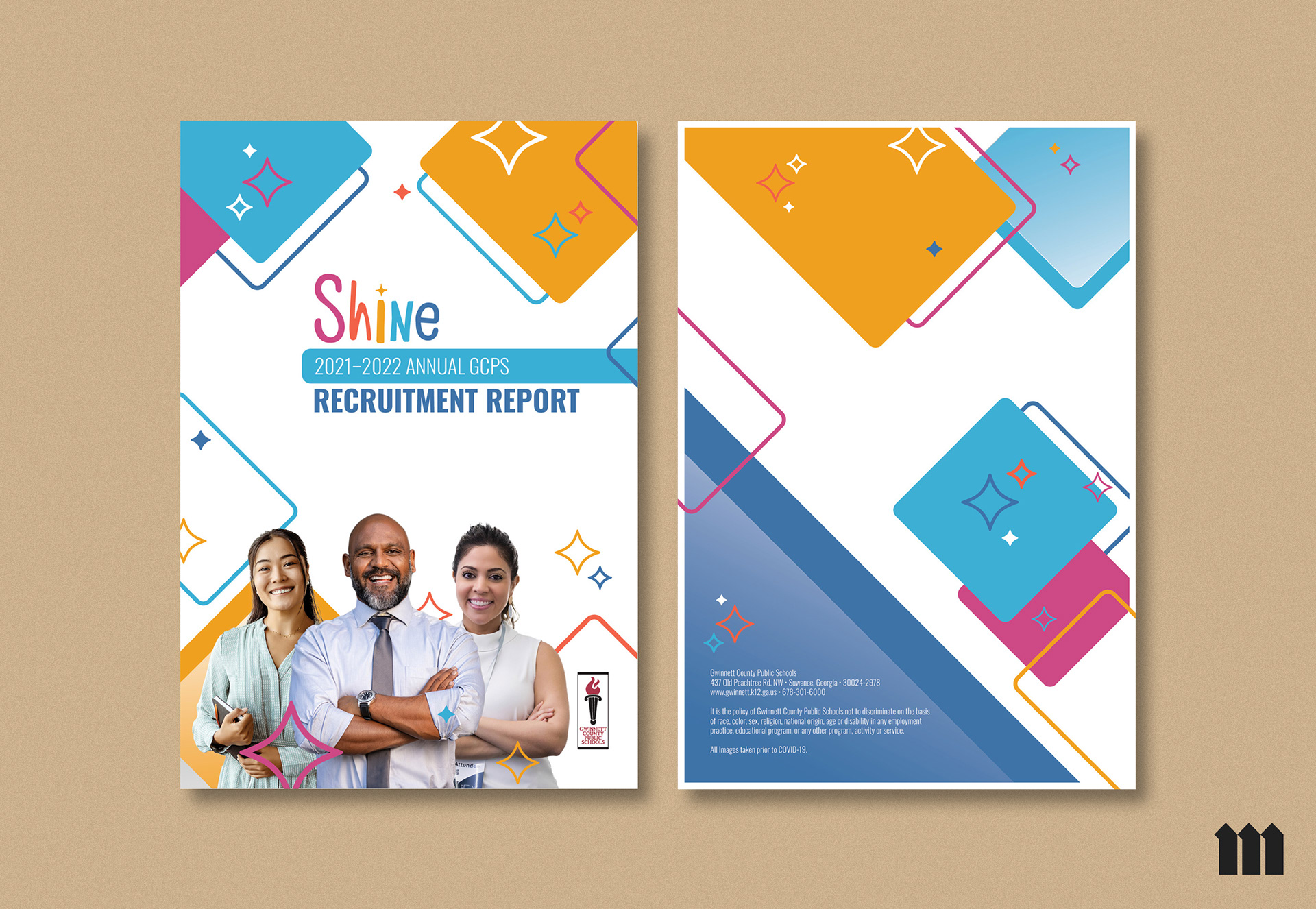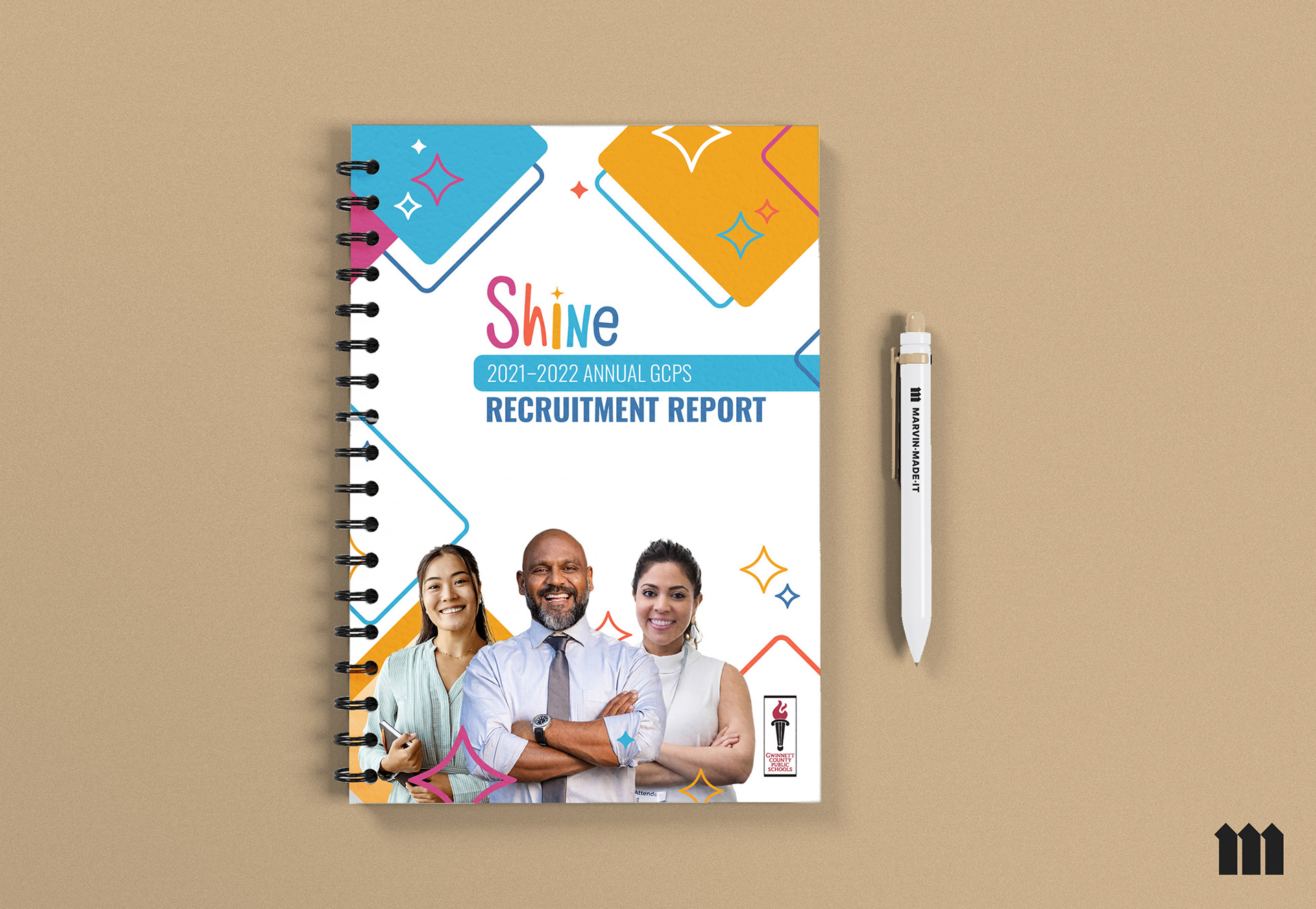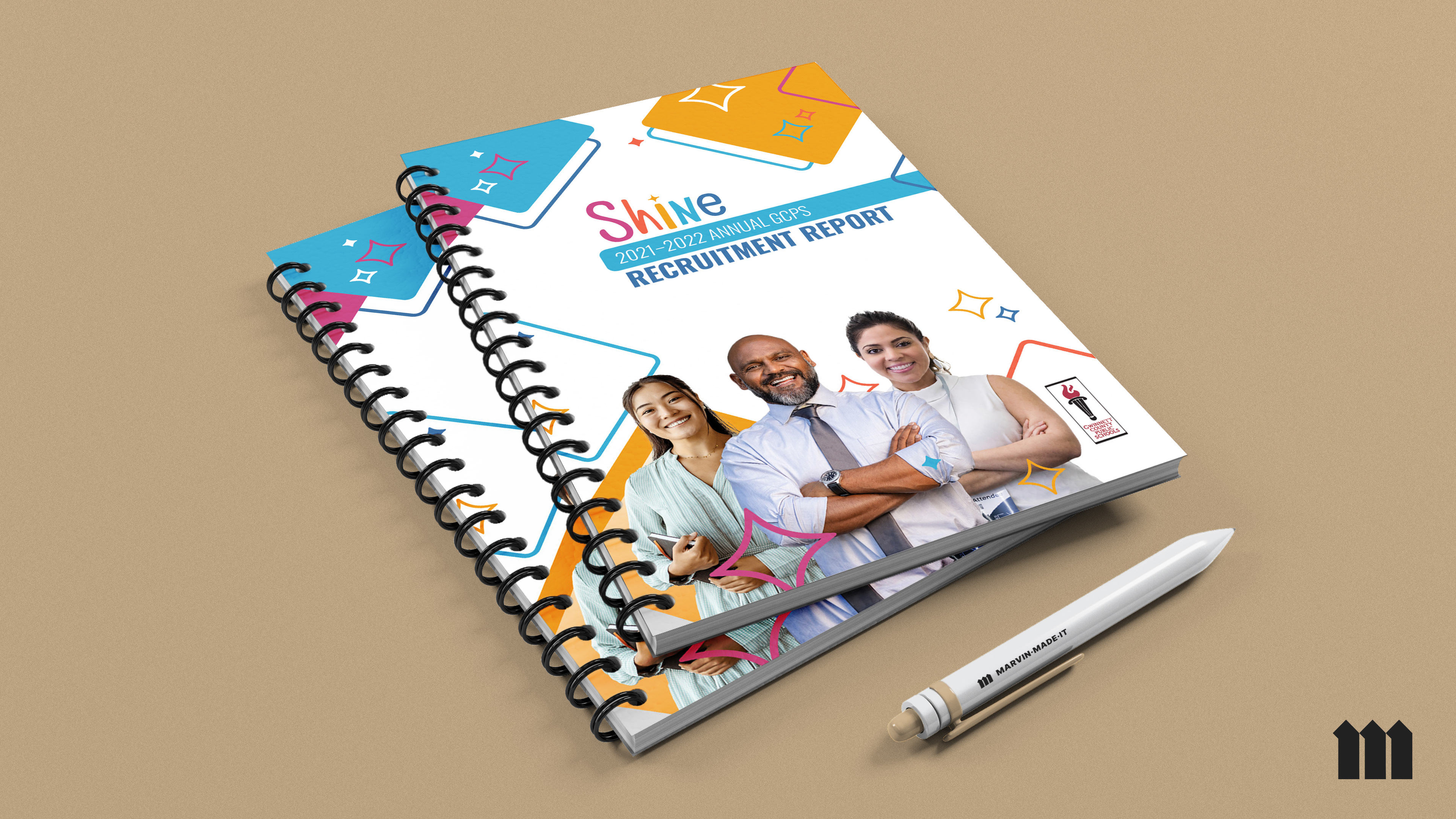
During my time with MIGHTY8th in Duluth, GA., GCPS is one of their bigger clients. For this project, I was tasked with coming up with a new cover design for the front and back of their annual report. Gwinnett County Public Schools is the “mother” brand, and Shine is a campaign they were running with the school system. Both brands wanted to be visibly present on the cover.
For the cover, they were very specific to represent diversity. They wanted representation with different demographics such as Hispanic, African American, Asian, man, woman, college-aged, middle-aged, retirement-aged, and so forth.
Along with finding imagery of individuals that fit the description, my overall concept of diversity was about having multi-colored rectangles and squares in different sizes and portions. Representing all humans. I knew I wanted this to be my abstraction of the term. Shine's color palette also drove this home and I played off the colors of their brand. The stars were also added because they were intended to have foil embellishments which was also requested by the client.
Along with finding imagery of individuals that fit the description, my overall concept of diversity was about having multi-colored rectangles and squares in different sizes and portions. Representing all humans. I knew I wanted this to be my abstraction of the term. Shine's color palette also drove this home and I played off the colors of their brand. The stars were also added because they were intended to have foil embellishments which was also requested by the client.